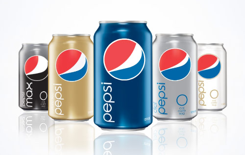
Now that the dust has settled from Pepsi's redesign, let's take a look at what they got for the estimated $1.2 Billion it will cost to update their branding.
The new design is above. The critical reaction has been mixed: some love the new look, while others think it makes Pepsi look like a generic brand, or the Obama "logo".
I won't go into the technical reasons that I think the logo is a bad move; you can see a really great analysis of it at Before & After. Instead I want to talk about the ROI that isn't going to happen because of the technical details. I encourage you to check out the Before & After link; it is chock full of great details about why the redesign is problematic.
Pepsi is trying to combat the Coca-Cola redesign launched last year. Coke went to a retro, clean, thoroughly planned strategy that conveys the "classic" nature of the brand. It is not retro (although often called that), but rather nostalgic. It maintains everything we know and love about the Coca-Cola package, and loses the extraneous bubbles, ribbons, and gadgets. I will blog about this more tomorrow.
Pepsi's answer was clearly to tell their ad agency (Arnell Group) to come up with a minimalistic, future-retro design. So there were 3 key changes:
1: The all lowercase, sans-serif font.
2: The new "grinning" logo (did you know that the logo was supposed to be smiling?)
3: The solid color cans.
For Pepsi, a company that made "generation next" their slogan, and encouraged drinkers to take the "Pepsi Challenge", one wonders what they gain by going to the simplistic design. It certainly doesn't draw the eye - there's a big empty space with a circle in it, and the word "pepsi" is far too static and bland. It also breaks with all the previous packaging, no matter what Pepsi tells you (video).
In the end though, I think the redesign can be chalked up to the massive ego of the ad agency's director, Peter Arnell. A 27 page PDF proposal for the new brand was leaked online, and it reads like a viral media ploy, or a hoax. The fact that Arnell Group is refusing comment suggests it is not. It is littered with references to the Golden Mean, and compares the attractiveness of the packaging with bends in the space-time continuum. It has to be seen to be believed (and can be seen here).
Thursday, February 19, 2009
Pepsi's New Look
Posted by
Jason Carr
at
8:36 PM
Subscribe to:
Post Comments (Atom)
Followers
About
The messages of the advertising world are often "Delightfully Vague" - the title of the blog comes from a quotation by Bill Cosby:
"The very first law in advertising is to avoid the concrete promise and cultivate the delightfully vague."
Of course this satire hides an important truth: much advertising today does not convey a brand promise at all. This blog is an analysis and exploration of marketing and advertising today, in an insightful and (hopefully) entertaining format.

3 comments:
In art, particularly the one I draw from (music), minimalism is coming to a fore. When we belong to a society that says "more more more," why not scale it back? In being different, you become noticeable once again.
Also, in futuristic looking artwork, minimalism seems to play a key part.
Do I think there was a conscious effort to model the Obama logo? Maybe. When marketing a product, you want people to associate your brand with something positive they can associate with. For over half of Americans, and apparently the rest of the world, the Obama association is a good thing.
Whatever the reason, Pepsi's goal is to make more money in this recession (quickly becoming a depression). The rules have changed, and whatever they have to do to keep people's attention turned towards them so they keep making money they will do.
Funny that they hit the golden mean so hard. I always think its interesting that modernists go so crazy for the golden mean. They seem to have come to a conclusion that would go something like this: "Golden mean = beautiful, and there's nothing you can do about it." While I agree that there is some science behind beauty, they've really oversimplified. Beauty is an extremely complex interweave of many factors, and just because you can draw some rectangles on top of Heidi Klum's face doesn't mean that the Golden Section is inherently beautiful.
@Josh Peterson: While I agree with your argument that in a down economy, Pepsi will do everything to scrape another 1/10th% of market share (especially since that is worth millions), They shouldn't devalue their brand to do it. Long term, that creates major problems.
@Christopher: Excellent point. I noticed that everything in that document was a "mechanical" proof of beauty.
Post a Comment