I'm in Evanston, IL this weekend visiting friends. As any of you who have made the trek from Hillsdale, MI to Chicago know, the journey begins in earnest at the intersection of US 12 and I-69 South. In otherwords, Coldwater, MI.
At this particular onramp, one is greeted by the smiling visage of a "Col" Harland David Sanders, the originator of the Original Recipe Kentucky Fried Chicken. On this particular Thursday, I couldn't help but stop and have a piece of the Colonel's greasy, fatty, and incredibly delicious Original Recipe Chicken.
This experience began about a week ago - my Dad and I love to talk advertising and marketing. We wonder... Why did KFC stop marketing the Original Recipe chicken? Is it health concerns? Looking at their latest product, Kentucky Grilled Chicken, makes me think that KFC has sold the poor Colonel up the river - posthumously - by abandoning their bread-and-butter chicken in favor of the health conscious "grilled" alternative. Of course, neither is good for you, so you should just eat the original recipe because it tastes better.
But all of this made me wonder two things:
1: When is the last time you saw an ad for original recipe chicken?
2: When was the last time you ate original recipe?
I have disturbing news: KFC hasn't run an ad for Original Recipe in a long time. It is sad to think that an entire generation may grow up too worried about fat to enjoy the Colonel.
Friday, August 21, 2009
Tasty Food You Forgot About: Evanston, IL Edition
Thursday, August 13, 2009
Redbox has Blockbuster seeing red
I ran across an interesting article in the USA Today on Wednesday.
I'm sure we've all seen those Redbox kiosks popping up in WalMarts, conveneience stores, and even McDonald's all over the country. What is interesting about this article is not the implication that Redbox is a potential game changer - that much is obvious - but rather this comment from Chase Carey, President of News Corp.
"Our (DVD) product rented at a dollar is grossly undervalued. It's a real issue. And we're actively determining how to deal with it."What Mr. Carey is saying here is not fleshed out in the USA Today article - Carey thinks that a DVD rental ought to be worth more than $1 to the consumer. Most likely, Carey would hope that Redbox revert to Blockbusteresque prices of 4.99 for a 2 day New Release rental. Is this just a case of corporate greed, or is there a real "race to the bottom" being created?
A New DVD costs Blockbuster/Redbox/Netflix/etc. aproximately $18. Redbox can rent that DVD aproximately 15 times, and averages $2 a transaction (meaning that the average Redbox customer keeps the DVD for 2 days, and pays $1/day). That means that, absent other overhead costs, Redbox stands to make $12 per DVD in each machine. By the way, there are 22,000 Redbox kiosks, each offering aproximately 700 DVDs for rental, encompassing up to 200 titles.
And of course, Redbox manages to sell some DVDs to outlets once they have been rented 15 times, so there's a little more wiggle room in the numbers than a $12 figure implies.
Compare that to Blockbuster's lifecycle - $18 for a DVD, $4.95 per rental. If Blockbuster can rent that same DVD 15 times, at $4.95, they would make over $55 on the disc, plus whatever they could sell it for.
So it's clear where the motivation for Carey's comment above comes in - there's a much smaller pie for everybody to get a slice of in Redbox's world than in Blockbuster's world. And unsurprisingly, 20th Century Fox and Universal are both engaged in boycotts or lawsuits with Redbox, attempting to eliminate the competitor before it's too late.
But my Dad once told me that "Once you've paid 99 cents for a Big Mac, it's never worth more than 99 cents to you." I think that's true here: it's already embedded in the mind of the consumer that a DVD rental can cost as little as $1. If that's the case, it would behoove the rental industry to come up with new and creative ways to make a profit - like Netflix.
Wednesday, August 12, 2009
Skittles - Taste the... Interwebs?
Social marketing is a giant experiment. Nobody really knows what they are doing or what they are looking to get in return, but everyone knows that to succeed on the Web today, it is essential to harness the power of world of mouth in social networks like Facebook, Twitter, MySpace, and the other, lesser networks.
There's a standard pattern in these situations. Companies and non-profits are scrambling to integrate facebook and twitter with their web pages, and to offer token "interactivity" to gain a few more seconds of your attention.
But a few companies are taking the plunge, for better or worse, and devoting a large portion of their resources to social media marketing techniques. Take Skittles for example.
The google results for the search term "skittles" yield 3.81 Million hits, the first of which is skittles.com. The tag for their Web site is "Skittles.com - Interweb the rainbow. Taste the rainbow."
Interweb the rainbow? What?
Entering skittles.com gives you their new site (launched March 2), which is simply an overlay that sits in the top left corner of your web browser. It sits over the twitter feed for #skittles, the facebook fan page for Skittles, or the YouTube content from the skittles channel.
The potential for word of mouth is outrageous, but this strategy has flaws. Just a few days after launch, the Skittles site was deluged with profane tweets and the site had to be redesigned to make the Twitter feed less prominent. And of course, the major question is how Skittles will measure the ROI of this campaign. How do you track sales from twitter, facebook, and youtube?
In the end, is the Skittles strategy little more than an opportunity for every alcoholic twitter user to tweet out that they made skittles infused vodka?
Tuesday, February 24, 2009
Eye of the Tiger
Tiger's back at this week's Accenture Match Play Championship, and so are the ads featuring golf's greatest player. Accenture debuted two new ads, and Nike put together a great ad featuring all five of it's sponsored golf professionals (below).
Of special interest to me, however, is the advertisement being run by the PGA. At this time I have not been able to find the advertisement, but I will keep looking and post it as soon as I can. It features Tiger, in the dressing room, lacing up his shoes while whistling "Eye of the Tiger."
The ad is great because it says exactly what it needs to. Simple white text says "He's back." and fades to the PGA logo and the Accenture Match Play Championship. Everyone recognizes the song, and having Tiger whistle it provides a bit of ironic humor while making the point - he's focused, he's back, and he's ready to play.
But what a lot of people don't know is that the ad is actually a re-framing of a similar ad for the Fed-Ex Cup playoffs several years ago. They just took the raw footage, revised the text, logo, and tournament, and threw it back on the air. Genius on the part of the PGA, since the ad is probably more appropriate now than it was 3 years ago.
Saturday, February 21, 2009
"Late Night" Does it Right
People who know me know that I'm a big fan of Late Night with Conan O'Brien, although I don't get to see the show as much as I'd like because I don't own a TV. Of course, Conan had his last show last night, and taking his place on Late Night will be SNL alum, Jimmy Fallon. He's been going through all the motions that a new host goes through, including one of the most important: choosing a logo for the show. It is crucial that Fallon develop a different identity than Conan, while maintaining the "vibe" of late night. A refresher for those who don't remember Conan's logo:
Conan's logo worked because it was quirky - it reflected his brand of off-beat humor. The strings hanging the nameplate in front of a perspective skewed backdrop of New York was also much different than Leno (although Leno and Conan both had caricatures of their faces associated with the show) or anything on other networks.
So Fallon has big shoes to fill. Fortunately, I think that the Late Show has gotten a good start. Fallon is a lot less outrageous than Conan, and the new logo should reflect that. So, they narrowed it down to three logos:![]()
![]()
![]()
Of these, I find Logo #1 to be the most compelling. It blends well with the skyline, and the stairstep pattern of the text is really appealing and draws your eye nicely to the name of the host. I think Logo #2 would be serviceable, but not ideal - it makes the name of the host too dominant - this is LATE NIGHT with Jimmy Fallon, not the Jimmy Fallon Show. Part of the reason Conan was so successful was because he had so many great supporting writers and cast. Abe Vigoda, for example.
Logo #3 looks too much like SNL, and while Fallon was on SNL, I think most people remember him from having to yell at him when he cracked up during every skit. Was there a single skit he was in where he didn't laugh the whole time? Besides, Late Night isn't just another SNL. It's nothing like it, and the branding should reflect that.
Watch Jimmy present the logos - the video is especially interesting because there are mockups of how the logos look on coffee cups, which is one of the major exposures that audiences will get.
By the way, the winning logo was #1:![]()
Thursday, February 19, 2009
Pepsi's New Look
Now that the dust has settled from Pepsi's redesign, let's take a look at what they got for the estimated $1.2 Billion it will cost to update their branding.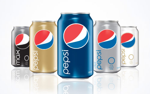
The new design is above. The critical reaction has been mixed: some love the new look, while others think it makes Pepsi look like a generic brand, or the Obama "logo".
I won't go into the technical reasons that I think the logo is a bad move; you can see a really great analysis of it at Before & After. Instead I want to talk about the ROI that isn't going to happen because of the technical details. I encourage you to check out the Before & After link; it is chock full of great details about why the redesign is problematic.
Pepsi is trying to combat the Coca-Cola redesign launched last year. Coke went to a retro, clean, thoroughly planned strategy that conveys the "classic" nature of the brand. It is not retro (although often called that), but rather nostalgic. It maintains everything we know and love about the Coca-Cola package, and loses the extraneous bubbles, ribbons, and gadgets. I will blog about this more tomorrow.
Pepsi's answer was clearly to tell their ad agency (Arnell Group) to come up with a minimalistic, future-retro design. So there were 3 key changes:
1: The all lowercase, sans-serif font.
2: The new "grinning" logo (did you know that the logo was supposed to be smiling?)
3: The solid color cans.
For Pepsi, a company that made "generation next" their slogan, and encouraged drinkers to take the "Pepsi Challenge", one wonders what they gain by going to the simplistic design. It certainly doesn't draw the eye - there's a big empty space with a circle in it, and the word "pepsi" is far too static and bland. It also breaks with all the previous packaging, no matter what Pepsi tells you (video).
In the end though, I think the redesign can be chalked up to the massive ego of the ad agency's director, Peter Arnell. A 27 page PDF proposal for the new brand was leaked online, and it reads like a viral media ploy, or a hoax. The fact that Arnell Group is refusing comment suggests it is not. It is littered with references to the Golden Mean, and compares the attractiveness of the packaging with bends in the space-time continuum. It has to be seen to be believed (and can be seen here).
What was Hulu thinking?
Yesterday Boxee announced that it was removing content from Hulu from it's service. For those unfamiliar with Boxee, it is free media center software that provides connectivity to Hulu, YouTube, CNN, CBS, and downloaded content and plays it directly on your TV. Hulu, an online media portal run by NBC and Fox, was one of the biggest draws for Boxee because Boxee provides an interface for Hulu that makes it easier to use on a TV.
The integration of Boxee and Hulu provided Hulu with nearly 100,000 streams last week - major traffic - and lost of exposure to new audiences. So what was Hulu thinking, removing it's content from Boxee?
First, it wasn't "Hulu" that removed the content, but Hulu's partners (read: NBC and Fox). These networks have a great reason to want to remove the content from Boxee: They don't want you to watch their content on your TV through the internet. They want you to watch it over-the-air. Why? Because over-the-air ads sell for significantly higher rates than online ads do. So they lose money when you watch the show through Boxee and not on your TV.
But somewhere along the line they figured that many people either don't have TV, or don't want it, so NBC and Fox launched Hulu. Hulu is meant to be watched on your computer (according to NBC/Fox), not on your TV. Boxee breaks that barrier down, and makes the networks nervous. What if people start switching from TV to Boxee? What if they speed up the death of network television? These concerns (driven by monetary decision making) are what drove NBC/Fox off of Boxee.
The point? It's temporary. Networks can't keep pretending that the Internet isn't a major provider of content - it is the major provider of content. The sooner that someone pushes full-fledged on-demand TV over IP, the bigger piece of the pie they can control. It seemed that NBC and Fox were forward thinking, new-media savvy juggernauts, but clearly their hands are tied by the old way of thinking.
